Visual Management Glossary: Key Terms
Definition of Data visualization
What is data visualization?
Data visualization is the practice of representing information and data through visual elements, such as charts, graphs, maps, and dashboards. By translating raw numbers into visuals, data visualization makes complex datasets easier to interpret, enabling people to quickly spot trends, outliers, and relationships that would be difficult to detect in spreadsheets or text-based reports.
This approach is essential in today's data-driven world, as it allows both technical and non-technical audiences to understand and act on information efficiently. In essence, it transforms raw data into accessible, meaningful graphics that support better understanding and communication across all levels of an organization.
How does data visualization work?
The process of data visualization typically involves several key steps:
- Defining the question or story you want your data to answer or tell.
- Collecting and preparing the data, which may include cleaning, sorting, and selecting relevant metrics.
- Choosing the right visual representation—such as a bar chart, line graph, or map—based on the type of data and the insights you want to convey.
- Designing and refining the visual elements to ensure clarity, accuracy, and accessibility for your audience.
Modern data visualization tools often allow for interactive exploration, letting users filter, drill down, and control views to uncover deeper insights. The right visualization not only presents data but also guides viewers toward actionable conclusions.
By following this process, organizations can turn raw datasets into clear, interactive visuals that drive faster and more informed decision-making.
Why is data visualization important?
Data visualization is crucial for several reasons, delivering a range of tangible benefits to businesses and individuals:
- Faster understanding: Visuals help people process information much more quickly than raw numbers or text.
- Pattern and trend recognition: Charts and graphs reveal trends, correlations, and anomalies that might otherwise go unnoticed.
- Improved communication: Visuals bridge the gap between technical and non-technical audiences, making it easier to share findings and insights across teams.
- Enhanced decision-making: By making data more accessible, visualization empowers organizations to make data-driven decisions and respond to changes proactively.
- Real-time monitoring: Dashboards enable teams to track key metrics and react to opportunities or risks as they arise.
- Storytelling: Well-designed visuals turn data into compelling narratives that support strategic planning and stakeholder buy-in.
What are examples of data visualization?
There are many types of data visualization, each suited to different types of data and business needs:
Bar charts
Compare values across categories, such as sales by region or product.
Line graphs
Show trends over time, like website traffic or stock prices.
Pie charts
Illustrate proportions within a whole, such as market share.
Heat maps
Use color to represent values, highlighting patterns in large datasets.
Scatter plots
Reveal correlations between two variables, such as marketing spend and revenue.
Dashboards
Combine multiple visualizations for a comprehensive, real-time view of business performance.
A common and powerful example in the tech industry is the use of project management dashboards.
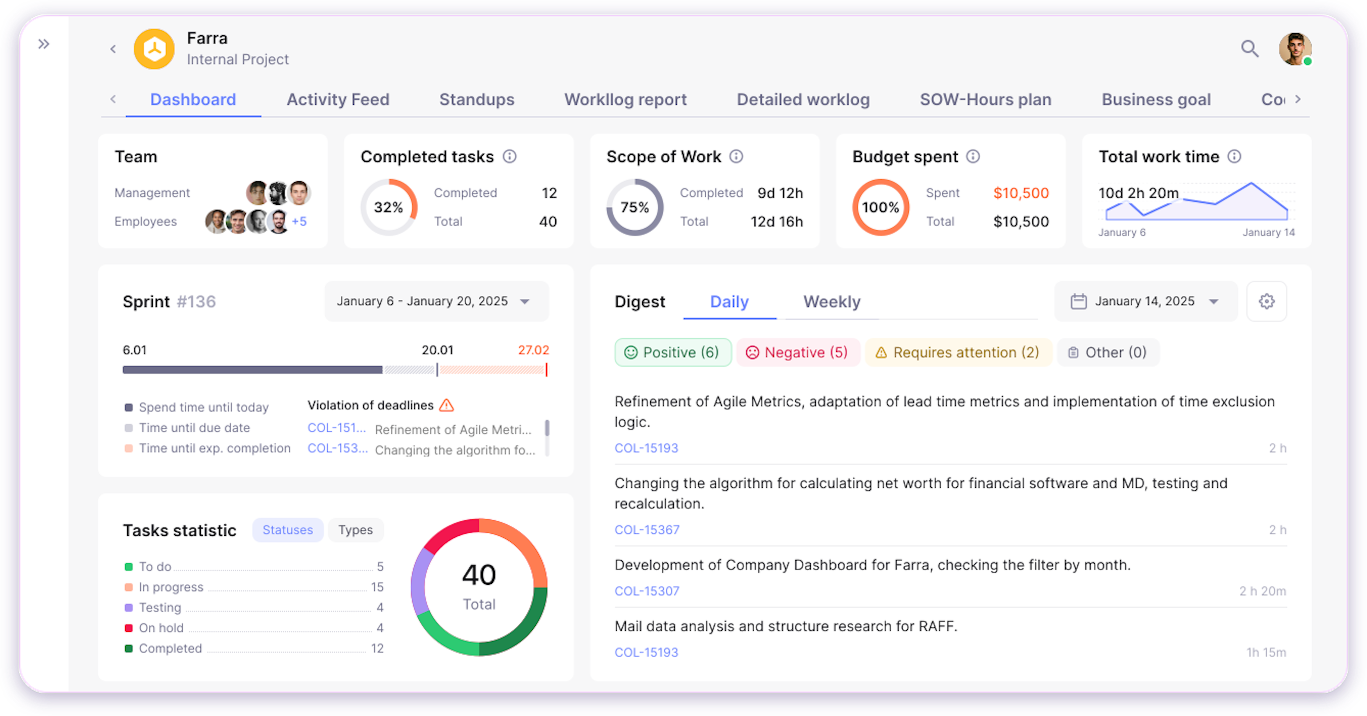
For instance, a project health dashboard visualizes key indicators like percentage of tasks completed, upcoming deadlines, budget versus actual spending, and resource utilization. By consolidating this information into interactive charts and graphs, project managers can instantly identify overdue tasks, monitor progress toward milestones, and make data-driven decisions to keep projects on track.
Such dashboards are widely used in software development to provide transparency for stakeholders, facilitate agile ceremonies, and ensure that teams can quickly respond to risks or changes in scope. This approach turns complex project data into actionable insights, supporting better, faster decisions throughout the project lifecycle.
How can Enji be used as a data visualization tool?
Enji provides advanced data visualization capabilities tailored for modern, distributed teams and project leaders. By integrating with tools like Jira, GitHub, and Slack, Enji automatically gathers real-time data from your workflows and presents it in clear, actionable dashboards. With Enji, users can:
- Monitor project health and team performance through interactive dashboards that visualize key metrics such as task progress, delivery speed, and resource allocation.
- Spot risks and bottlenecks with visual alerts and trend analysis, enabling proactive intervention before issues escalate.
- Customize reports to highlight the most relevant insights for different stakeholders, from executives to team leads.
- Drill down into specifics—for example, viewing code review activity or worklog trends—without sifting through raw data.
Unlike generic business intelligence tools, Enji's visualizations are designed for the unique needs of software development and project management. This makes it easier for leaders to see the big picture, identify areas for improvement, and drive results—all without manual data wrangling.
Key Takeaways
- Data visualization is the practice of turning raw data into visual formats like charts, graphs, and dashboards for easier understanding and communication.
- Effective data visualization simplifies complex information, reveals patterns, and supports faster, data-driven decisions.
- Common visualization types include bar charts, line graphs, heat maps, and interactive dashboards, each serving different analytical needs.
- Enji's integrated dashboards and reporting tools enable teams to visualize project metrics, spot risks, and communicate insights without manual effort.
- Leveraging data visualization is essential for organizations aiming to stay competitive, agile, and aligned in a data-driven world.

Last updated in July 2025