Visual Management Glossary: Key Terms
Definition of Cumulative Flow Diagram
What is a Cumulative Flow Diagram?
A Cumulative Flow Diagram (CFD) is a visual management tool used in Agile and Lean methodologies to track and analyze workflow in a project over time.
It displays the status of work items as they move through different stages of a process, which are represented by colored bands that grow and change shape as work progresses. The CFD plots cumulative counts of work items against time, with the vertical axis showing the number of items and the horizontal axis representing the timeline of the project.
As a visualization of the flow of work through a system, CFDs help teams identify bottlenecks, delays, and potential process improvements. They provide insights into work in progress (WIP), cycle time, throughput, and other key metrics that can help optimize workflow efficiency and predictability.
What is the difference between a burn-up chart and a Cumulative Flow Diagram?
The difference between burn-up charts and Cumulative Flow Diagrams is in their focus and the information they provide. They both show progress over time, but a burn-up chart shows the total scope of work planned and work completed. In contrast, a CFD breaks down the workflow into multiple stages for a detailed view of where work items are in the process at any given time.
Another key difference is that burn-up charts display two lines for this information, while CFDs use colored bands. Burndown charts are focused on the result, and CFDs show the flow of work through the entire system, with an emphasis on visual indicators of process metrics like work in progress, cycle time, and throughput that are not clear in burndown charts. Teams interested in high-level reporting to stakeholders can use burn-up charts, while CFDs are more valuable for teams that want to improve their process efficiency and identify workflow bottlenecks.
What information does a Cumulative Flow Diagram provide?
A Cumulative Flow Diagram is an instrument that provides essential insights into project workflow dynamics and team performance metrics, and displays work in progress, cycle time, throughput, bottlenecks, lead time, and process stability. The diagram visualizes how work moves through a process over time to help teams make data-driven decisions.
- Work in progress (WIP): The vertical distance between bands shows how many items are in each stage.
- Cycle time: The horizontal distance between bands indicates how long it takes to move through stages.
- Throughput: The slope of the "Done" area reveals the rate at which work is being completed.
- Bottlenecks: Bands that widen indicate where work is accumulating in specific stages.
- Lead time: The horizontal distance from the entry point to the exit point shows the overall delivery time.
- Process stability: Parallel bands indicate a stable, predictable workflow, while irregular patterns suggest inconsistency.
Teams that understand these metrics can optimize their processes, improve efficiency, and deliver value more predictably.
How to read a Cumulative Flow Diagram?
Reading a Cumulative Flow Diagram requires an understanding of its components and what the visual patterns reveal about a workflow. The horizontal axis represents time, while the vertical axis shows the cumulative count of work items.
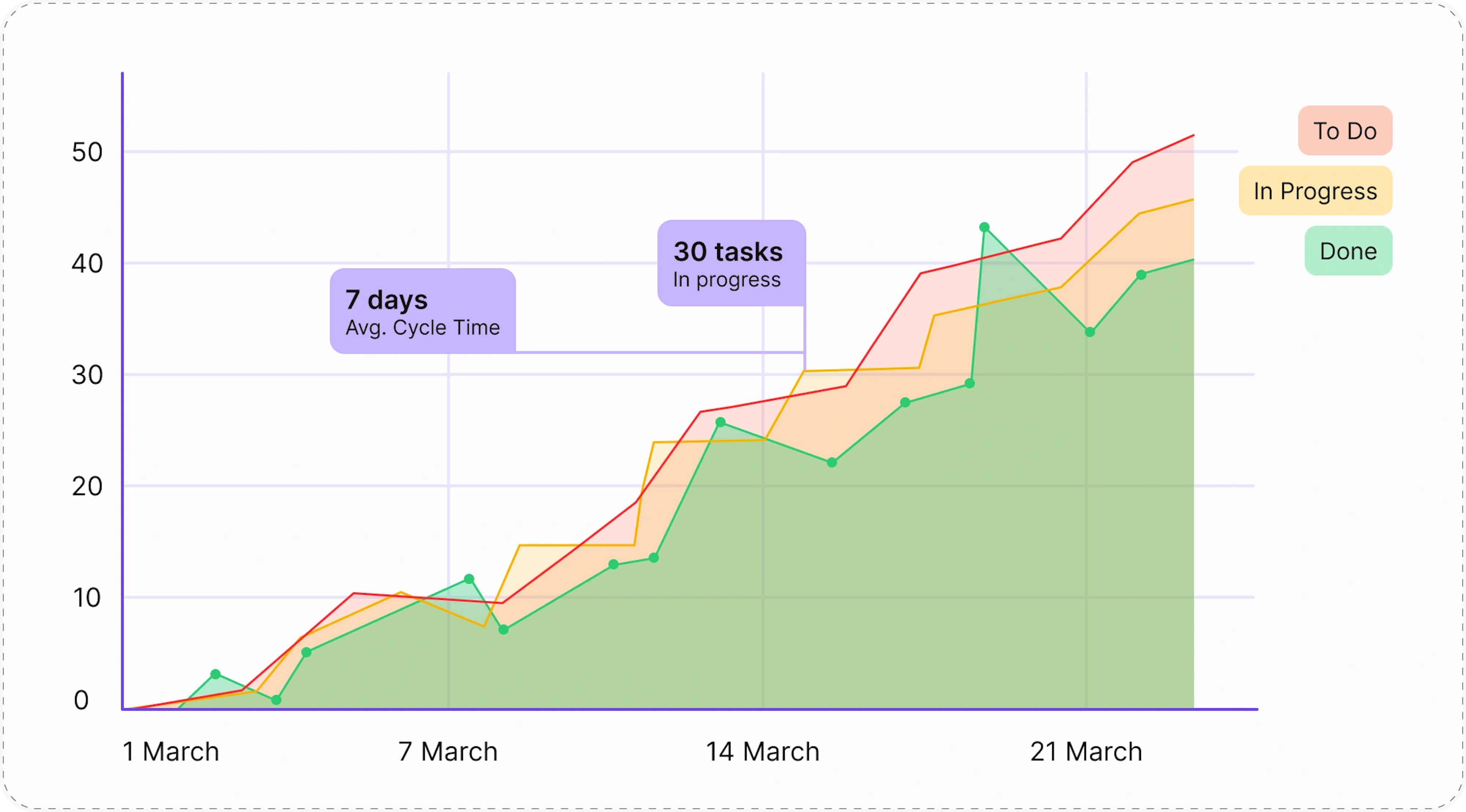
The different colored bands that run from left to right represent various workflow stages (like "To Do," "In Progress," and "Done"). The wider the band, the more work is done in that particular stage.
As more work is added, the upper slope of the diagram increases and shows the rate at which this is happening. Meanwhile, the lower slope of the "Done" band indicates the team's delivery rate or throughput. Healthy CFDs display more or less parallel lines between stages that indicate a smooth flow of work with consistent cycle times. Any sudden changes in the width of a band, unusual bulges, or flat sections can signal workflow problems worth investigating, such as process delays, scope changes, or resource constraints that may be impacting productivity.
Key Takeaways
- CFDs visualize work that flows through different process stages over time to make work patterns visible.
- The vertical distance between bands represents Work in Progress (WIP), which directly impacts cycle time and system predictability.
- The horizontal distance between bands shows cycle time (how long work takes to flow through stages).
- Parallel bands indicate a stable, predictable workflow, while expanding bands signal bottlenecks.
- Unlike burn-up charts that focus on completed work vs. scope, CFDs provide insights into the entire workflow process.
- CFDs help teams identify process improvement opportunities by highlighting where work is getting stuck.
- CFD shows metrics such as work in progress, cycle time, throughput, bottlenecks, lead time, and process stability.
- Regular patterns in a CFD suggest process stability, while irregular patterns may indicate underlying process problems.
- Effective use of CFDs promotes data-driven discussions about process optimization rather than subjective opinions.


Last updated in March 2026