A Smooth Finish to 2024: Agile Metrics Across All Projects
Learn about the new Agile Dashboard and improvements to the Activity Feed that allows for more convenient use of Enji's data collection and analysis.
Release dates: 12/24/2024
Comprehensive Agile Dashboard
Enji now offers users an Agile Dashboard that displays metrics across all projects that include Agile metrics. These are:
- Lead Time: Displays the time taken from the creation of a task to its completion (reaching the final status).
- Cycle Time: Shows how quickly the team completes tasks. It calculates the time from the task's initial status to its final status.
- Work Time: Measures the time from the first worklog entry in a task to its completion (final status).
- Estimation Correctness: Analyzes how accurately developers estimate tasks. It compares the task's original estimation with the actual time spent on its completion.
- Rejection Rate: Indicates how often completed tasks are returned for rework after testing or code review.
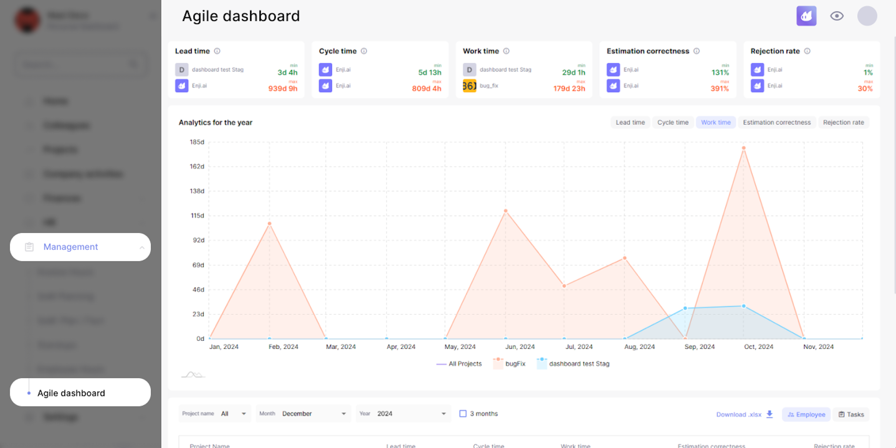
The page shows the maximum and minimum amounts for each metric. Users can filter the list to view as few or as many projects or metrics as they want for greater convenience. The Agile Dashboard also allows users to explore how these metrics are measured among individual employees on the project. Also, the dashboard displays the number of tasks completed in a given period and the amount of time spent on each task individually and together.
For reporting, the list can be downloaded as an xlsx file.
The Agile Dashboard is available to users with the following roles: PM, DM, CTO, and Stakeholder.
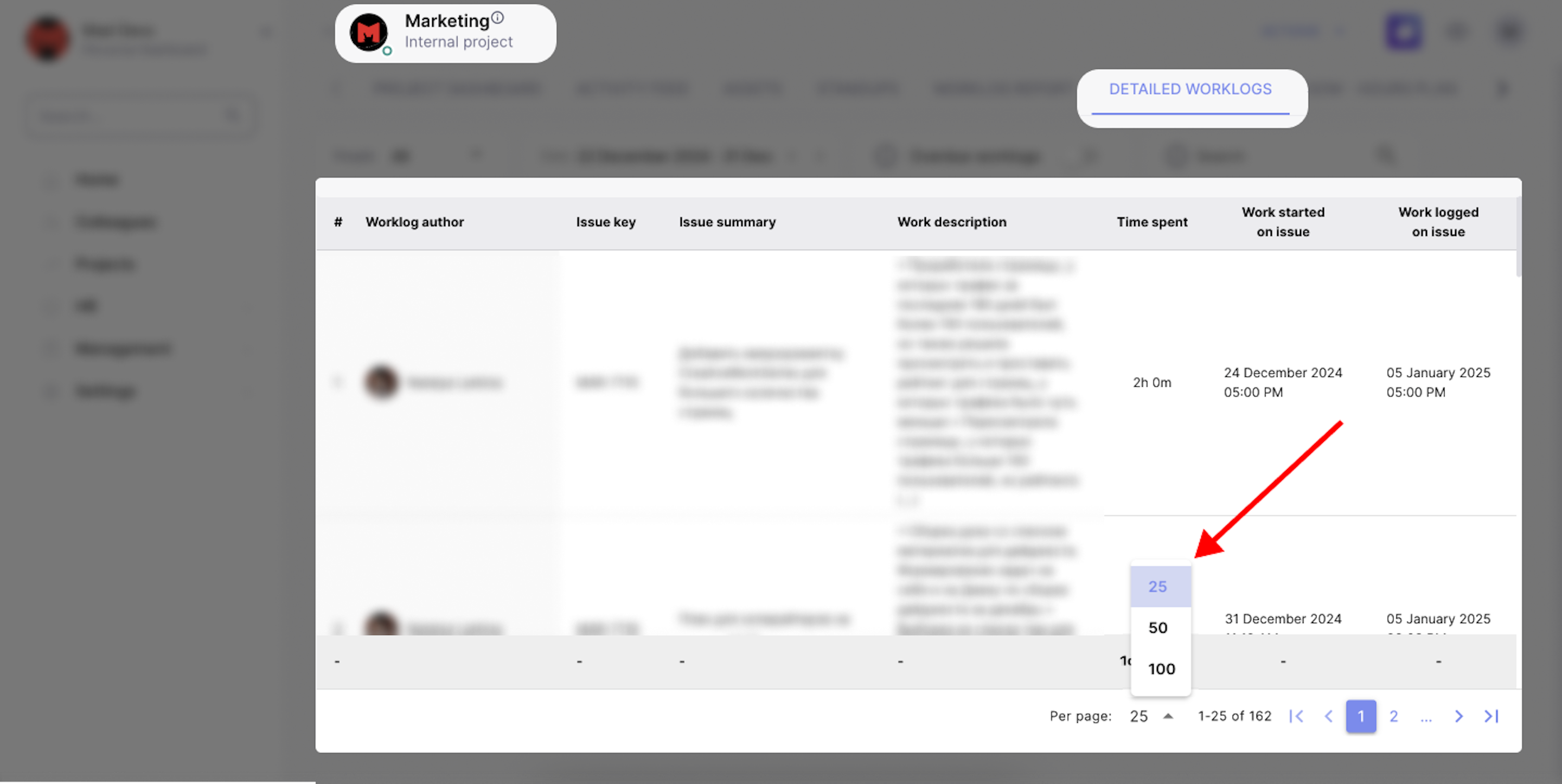
Added ease of use for Detailed Worklogs
For users with large teams, viewing worklog details can be a challenge, given the volume of data involved. The Enji team recently made it possible to select the number of worklogs that will be displayed on the page at a given time. Now, view as many or as few worklogs as needed.
Improved Activity Feed design
After reviewing other projects and tools, the Enji team decided to implement changes to the visual aspects of the Activity Feed. The shapes in the feed correspond to certain types of activities:
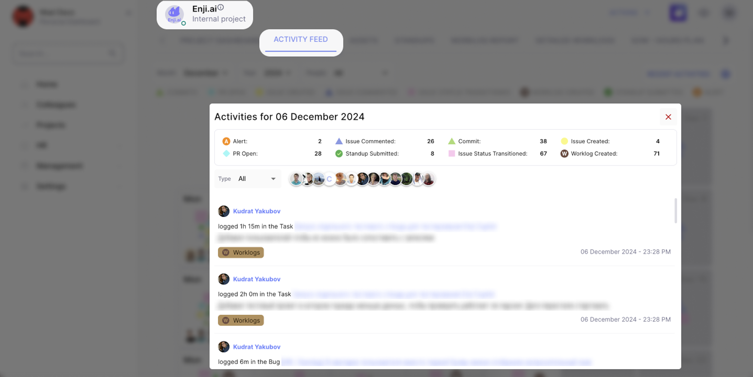
While the size of the shape represents the amount of time spent on the activity on a given day:
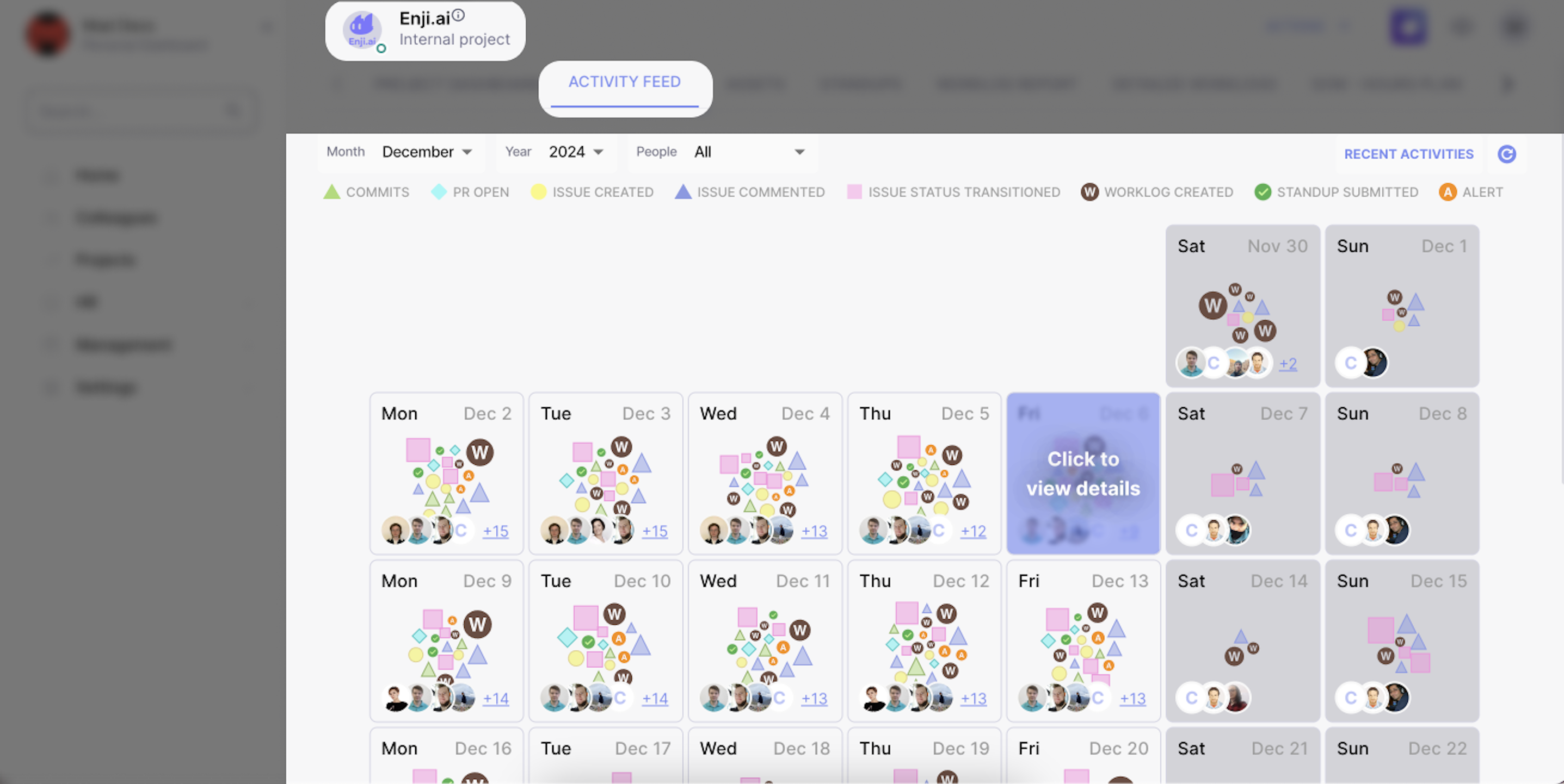
This new design allows users to quickly observe which tasks employees and teams are spending time on the most.
The Activity Feed is available to all Enji users.
The Enji team continues to review and improve existing features and functionality to deliver the best user experience to all roles.