Performance Tracking Glossary: Key Terms
Definition of Performance dashboard
What is a performance dashboard?
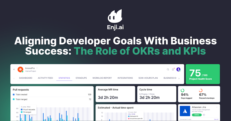
A performance dashboard is a centralized, visual workspace where teams can track, analyze, and share live metrics on project progress, team productivity, quality, budgets, and business outcomes.
Unlike traditional spreadsheets or static reports, a performance dashboard pulls data from multiple systems, such as code repositories, task trackers, and finance tools, into real-time, interactive charts and tables. These dashboards empower engineering teams to monitor daily activities, identify bottlenecks, and spot trends, all at a glance.
Performance dashboards are only as effective as the metrics they track. Each company, team, or project defines its own Key Performance Indicators (KPIs)—the targeted measures of success that drive decisions and reflect organizational goals.
Why are performance dashboards important for engineering teams?
Performance dashboards matter for engineering teams because they:
- Aggregate complex, siloed data into a single, consumable view, saving hours previously spent hunting for status updates or context.
- Highlight risks, blockers, and missed targets the moment they arise, allowing for timely intervention and improved delivery outcomes.
- Support data-driven decision-making by showing not just progress, but also the "why" behind slowdowns or overruns.
- Foster cross-functional transparency, so everyone sees the same story in real time, reducing meeting overhead and miscommunication.
Thus, by helping teams visualize live project status and team health, performance dashboards foster proactive management and multi-level accountability—raising the bar for productivity, adaptability, and transparency across engineering organizations.
What are the key components of an effective performance dashboard?
Not all performance dashboards are created equal. To drive meaningful outcomes rather than just visual appeal, it's critical to focus on components that balance clarity, relevance, and real-time responsiveness.
Essential components of a high-impact performance dashboard include:
- Live progress tracking: Real-time task completion rates, burndown charts, sprint velocity, and throughput indicators help teams and leaders track progress as it happens and adjust quickly if projects veer off course.
- Resource and workload insights: Team and individual capacity, allocation, actual hours logged (often via integrated worklogs), and utilization rates show where resources are stretched or underused, enabling proactive rebalancing.
- Risk and blocker flags: Early warnings for schedule delays, unresolved dependencies, and critical bugs highlight immediate threats and allow teams to intervene before issues escalate.
- Quality signals: Bug counts, code coverage, engineering KPIs, and test pass rates keep technical debt, release confidence, and code health visible at all times.
- Margin and budget tracking: Spending-to-plan, value delivery, and true cost per feature let stakeholders connect engineering activity directly to financial outcomes.
- Custom views by role: Tailored summaries for executives (strategic KPIs), managers (delivery health), and contributors (next priorities) ensure every participant gets just the insights they need—avoiding information overload.
- Interactivity and integration: The best dashboards update immediately as underlying systems evolve, offer intuitive controls, and bring together data from project, development, and comms tools for end-to-end accuracy.
Two things separate a dashboard that gets used from one that gets ignored: role-specific views (executives see strategic KPIs, managers see delivery health, and contributors see next priorities so no one drowns in noise) and live integration (it updates as the underlying tools change, pulling project, development, and comms data into one accurate picture).
A dashboard that shows these signals live (not a report someone exported last week) is what lets a manager act before the next status meeting instead of after it.
Build dashboards that explain why delivery changed
Dynamic Dashboards let each role track delivery, workload, quality, and budget from live project data, then drill into the reasons behind any number.
What types of performance dashboards does Enji provide?
Enji takes dashboards far beyond static reporting, delivering tailored, cross-functional insights at every level:
- Project dashboards: A live project performance dashboard that merges status updates, milestone progress, and risk alerts from all major tools, giving leaders and teams a true, unified "single source of truth."
- KPI dashboards: A KPI dashboard for project managers and leadership, high-level metrics for business, engineering, and financial performance, including trend analysis, variances, and actionable recommendations.
- Worklog-integrated dashboards: Harness Enlightening Worklogs to show planned vs. actual effort across the org, instantly surfacing utilization gaps, capacity bottlenecks, and over-/under-worked teams.
- Engineering team dashboards: Leverage Code Metrics to track code health, delivery cycles, code review patterns, and technical debt in real time.
- Financial performance dashboards: Use the Project Margins feature to track budget vs. actuals, profitability by project, cost per feature, and margin trends, giving finance and leadership clear visibility into project economics.
- Delivery metrics dashboard: Tracks velocity, cycle time, and throughput across sprints, so teams see delivery pace shift before it affects a release date.
- Role-specific views: Custom summaries for executives, line managers, engineers, and finance, ensuring each stakeholder sees exactly the insights they need, available using AI Summarizer.
What sets these apart is a shared foundation. Every dashboard pulls from the same live project data, so a number on the finance view and a number on the engineering view always tell the same story. Leaders stop reconciling conflicting reports and start acting on one version of the truth, updated the moment something changes.
Key Takeaways
- A performance dashboard translates complex operational data into live, actionable insights for teams and leaders.
- They are essential for engineering success, surfacing blockers, optimizing resource allocation, and supporting transparent decision-making.
- The most valuable dashboards feature live tracking, risk signals, worklog data, budget analysis, and adaptive summaries tailored by role.
- Enji empowers organizations with interactive, integrated dashboards, turning noise into clarity, aligning every contributor, and accelerating business and engineering impact.


Last updated in October 2025